5 Must-Haves for Mobile Mashup Design

5 Must-Haves for Mobile Mashup Design
Responsive design has become the most crucial factor for seamless user experience across all devices. The Qlik Sense platform is inherently mobile and provides a completely scalable functionality from desktop to smartphone. When designing a Qlik Sense application, the platform does the job for us when it comes to switching between devices. But what happens when you are building a mashup application that uses HTML + Qlik Sense objects?
You can create a good looking application without the limitations of sticking only to the Qlik Sense out-of-the-box functionality and UI. This blog is sharing our top 5 must-haves for designing a Qlik Sense mashup application that can scale across devices.
1. Strategic Layout
The challenge of designing a mobile application is that not only are there different screen sizes to consider but also different modes, whether it’s landscape or portrait mode. When the user switches from one mode to another, the application must take the correct shape and form in consideration to behave the same way as it does in the previous mode.
There are two cases to take into account:
A complete mashup using individual Qlik Sense objects
Since we use the Qlik Sense objects separate from other HTML elements within the application, the design can dictate the placement of objects as well as the wrapping of objects when the device changes modes. The design needs to take into account how the objects will be placed in landscape mode and how the objects will change positions when the device is changed or turned into portrait mode.
Mashup using an iframe
In this case, the contents of the page come straight from a Qlik Sense application, and the only HTML elements that the designer can customize is the navigation and frame of the application. This becomes a challenge for object placement and changes when the mode or device is switched from landscape to portrait. When designing your mashup know that when the user switches from landscape to portrait mode, or when the user switches from using a tablet to a mobile device, Qlik Sense automatically lays objects from the left to right and top to bottom. The objects must be strategically placed so that when the mode changes all the related KPI text and charts end up together and not stacked in random order.
To explain this case further, let’s look at a couple of examples below with two different styles of object placements.
Example 1 – The objects are designed in landscape mode to be in three columns with the intention to show all the related KPIs, charts and tables together. However, when the user switches to portrait mode or to a phone Qlik Sense will automatically alter the object placement from top to bottom and left to right, and the idea of the related objects staying together is lost.


Example 2 – The objects are placed in landscape mode to be in three rows instead of columns being aware of the fact that Qlik Sense will automatically reorganize objects when the user switches the mode from landscape to portrait. In this method all the related KPIs, charts and tables will still be together since they will be re-organized from left to right and top to bottom. The intention of the design is retained regardless of the change in mode of the device.


In conclusion, when designing your mashup application using an iframe to display the content, make sure you are aware of how Qlik Sense will alter the position of the objects when switching between modes and adjust your design accordingly.
2. On-demand Filters
Screen sizes for tablets and phones are limited so it’s a good idea to group all filters into an overlay window or a separate panel and show the filters panel only when the user needs it. This concept is similar to an online shopping experience where the filters are visible through a button or a link just at the point of need while browsing products. Similarly, in Qlik Sense mashups the filters can be accessed by a separate button or a link which is visible on the sheets at all times.

This will not only keep the page simple but also follow the theory of providing information to the user only at the point of need so that there is no information overload from a complex application.
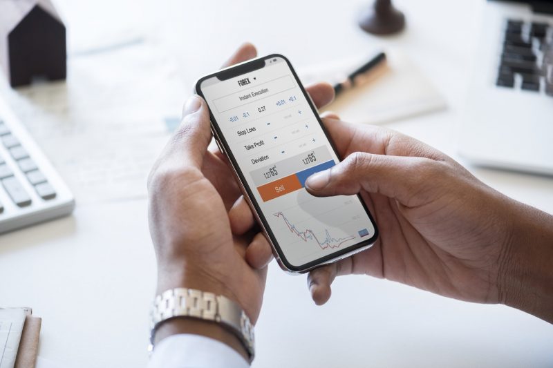
3. Finger-tap Navigation
When you plan to design a mashup, instead of utilizing the native Qlik Sense navigation, you may need to create your own. There are a significant number of ways navigation can be designed from tabbed navigation to a list, from hidden navigation to a constantly visible one. Each has its pros and cons which is a topic by itself but whatever the design may be, trying and sticking to the web standards is a golden rule of thumb. Meaning, design navigation that is familiar to the users or which they might have come across and worked with in other common mobile applications instead of re-inventing the wheel and struggling with user testing and adoption.


In addition to making the navigation self-evident, it should be made finger tap friendly so that active area sizes and spacings are big enough for a finger to make selections comfortably without clicking on something unintentionally.
4. Selections Display
A significant part of any data discovery application is that the users can filter and sift through data by various metrics and dimensions. The essential part of this process is showing the user what the current selections are by which they have filtered the data. Since we have limited screen sizes on mobile devices, we usually tend to give the current selections low priority. However, current selections can be designed and handled simply by showing it as a link to a separate panel that contains all current selections. Another option is displaying it in the form of breadcrumbs so that the user knows exactly where they are within their data discovery process. Whatever the design, don’t forget about this critical part of the application.
5. Less is More
We know that data-rich applications are very important for making business decisions but take a step back and think about the use cases for those “on the go” users who are only interested in consuming data through a mobile device. Most of these users want their applications to help them performing tasks quickly and easily. Cutting down on unnecessary fluff like controls and icons that are not directly helping users is one way to declutter. Also re-organizing visualizations on different sheets rather than putting information all together in one sheet is another way of making sure only relevant content is displayed.
Prioritizing elements and showing only what is necessary will improve comprehension and provide a better user experience.
A Qlik Sense mashup application is meant to show Qlik Sense objects in varied kinds of creative environments and designs without any constraints. But if the application doesn’t scale as required from one device to another, then the purpose and the beauty of the mashup is lost. Keep these must-haves in mind within your design to make the transition seamless and the application to be truly responsive.
Apeksha Pathak, Senior UX Designer